NoSPACE Brand
How NoSPACE looks, moves and sounds. Use this page when you design a screen, write a sentence, make a store image or post about the app.
Three ideas behind everything.
NoSPACE looks after something people care about: their best moments. It should feel like a calm, careful app made by someone who plays too.
Quiet surfaces, one red signal. No flashing, no shouting. Motion is there to explain, not to impress.
Say what happens and what happens next. Show the real number. Never hide a limit.
Your clips, your channel, your PC. We show real game footage from real libraries, never stock.
The mark.
A squircle tile, a planet with a tilted ring, and a red comet in orbit. The planet is your library. The comet is a clip on its way to safety.
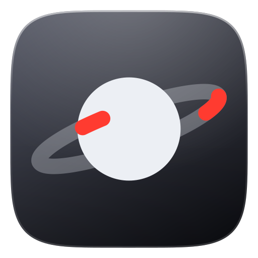 Dark tile#4B4E5B → #101116
Use on light backgrounds: #F2F2F5, white, light photos.
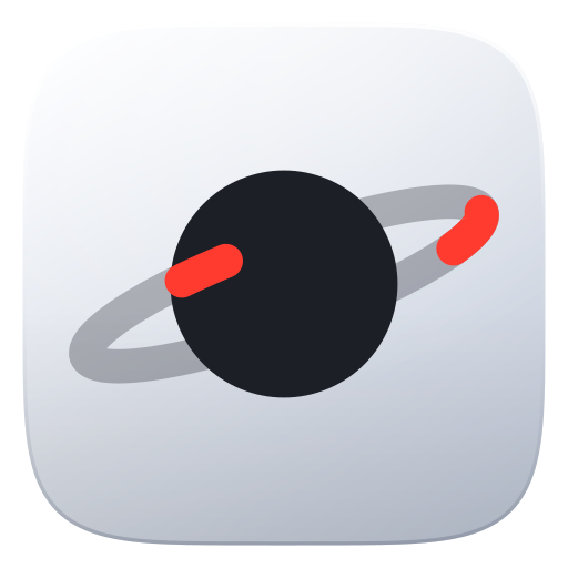 Silver tile#FBFCFE → #C2CAD8
Use on dark backgrounds: #09090D, game footage, dark UI.
Construction100 × 100 grid
- TileSquircle (superellipse), 92 of 100 units. Top-left to bottom-right gradient, soft top light, 1.3 unit rim.
- PlanetCircle, radius 20, dead center. #1D1F27 on the silver tile, #ECEFF4 on the dark tile.
- RingEllipse 74 × 15, stroke 6 at 30% opacity, rotated −20°. The front half cuts over the planet.
- Comet#FF3B30, 8.5% of the orbit, round caps. Six tail strokes behind it fade from 46% to 2%.
- ShadowOne soft drop shadow under the planet group, 26% opacity. Nothing else.
Clear space and minimum size
¼ W¼ WKeep a quarter of the tile width clear on every side.
96 hero48 header32 nav24 min UI 16 favicon
The vector mark goes down to 24 px. Below that, use the rendered PNG app icon, which is tuned for small sizes. Never show the comet tail below 24 px.
Lockups and the name
NoSPACEBY GAMERS ACADEMYNoSPACEAlways "NoSPACE"
"No" in brand red (#D92D22 light, #FF6B5E dark), "SPACE" in the text color. Geist Bold, letter spacing −0.025em. In plain text, write NoSPACE with no color.
Do and don't
 CLIP IT!
The comet moves once, then rests.
Point at the mark and the comet makes two smooth laps around the planet, then eases home. It is a small reward, not a loading spinner.
| Part | Spec |
|---|---|
| Duration | 2.4 s, two full laps |
| Comet path | stroke-dashoffset 0 → −202 → −200 on a path with pathLength 100, dash 8.5 91.5 |
| Ease out | cubic-bezier(.5,0,.2,1) to 94%, then cubic-bezier(.4,0,.4,1) to settle back the 2% overshoot |
| Tail | Same path, each stroke offset 3 to 18 units behind. Opacity in by 16%, hold to 55%, out by 84% |
| Breathe | Planet group scales to 0.95 at 7%, back by 20%, a tiny 1.04 pop at 97% when the comet lands |
| Trigger | Hover on the mark in the app. On the website hero it loops every 6 s with a 3.6 s rest |
| Never | As a spinner, while uploading, on every page load in the app, or with reduced motion on |
UI motion tokens
Ease
cubic-bezier(.2,.8,.2,1)
Fades, slides, page changes. 200 to 450 ms.
Spring
cubic-bezier(.3,1.3,.4,1)
Things you touch: toggles, chips, hover lift, toasts.
Comet
cubic-bezier(.5,0,.2,1)
Only the logo. Slow start, long glide.
Drop-in code
/* the comet head (.sl) and tail strokes (.tl, each with --l and --op) */
.comet .sl{animation:ns-run 2.4s linear}
.comet .tl{animation:ns-tail 2.4s linear,ns-tailop 2.4s linear}
@keyframes ns-run{
  0%{stroke-dashoffset:0;animation-timing-function:cubic-bezier(.5,0,.2,1)}
  94%{stroke-dashoffset:-202px;animation-timing-function:cubic-bezier(.4,0,.4,1)}
  100%{stroke-dashoffset:-200px}}
@media (prefers-reduced-motion:reduce){.comet *{animation:none!important}}
Mostly quiet. One red.
Neutrals carry the interface. Red marks the one thing that matters on a screen: the comet, the main button, the number you came for.
Light neutrals
Dark neutrals
Status, data and logo tiles
How much of each
Red is a signal, not a wallpaper. One red thing per view is the goal.
Contrast checksWCAG 2.2
| Pair | Ratio | Result | Use it for |
|---|---|---|---|
| Text #141418 on #F2F2F5 | 16.4 : 1 | AAA | All body text |
| Muted #5C5C69 on #F2F2F5 | 5.9 : 1 | AA | Secondary text |
| Accent #D92D22 on #FFFFFF | 4.8 : 1 | AA | Links and labels on cards |
| Accent #D92D22 on #F2F2F5 | 4.3 : 1 | AA large | Headings and bold labels only |
| Accent #FF6B5E on #09090D | 7.1 : 1 | AAA | Any text on dark |
| Muted #A2A2B0 on #09090D | 7.9 : 1 | AAA | Secondary text on dark |
| White on #E5172C (gradient end) | 4.7 : 1 | AA | Button text |
| White on #FF6A5C (gradient start) | 2.8 : 1 | Fails | Keep button text 14 px+ semibold, with the soft text shadow |
| Good #16A34A on #FFFFFF | 3.3 : 1 | AA large | Icons and bold status words |
| Warn #C27C0E on #FFFFFF | 3.4 : 1 | AA large | Icons and bold status words |
Geist for words. Geist Mono for numbers.
Two families from one designer, so they sit together naturally. Both are free on Google Fonts.
Fallbacks: -apple-system, "Segoe UI Variable Text", system-ui · mono: ui-monospace, "Cascadia Mono", Consolas.
Scale
Sentence case
"Your heroes this week", not "Your Heroes This Week". Caps only for small mono labels.
Numbers are mono
Counts, sizes, times and limits use Geist Mono with tabular figures, so they don't jump.
Tight headlines
Big type gets negative tracking. Body text keeps the default. Never track body text out.
Filled, simple, one color.
Icons are solid shapes on a 24 px grid. They take the text color. The selected one fills with the brand gradient.
Do: solid and gradient
Solid in the text color. Brand gradient for the selected item only.
Don't: outline or multicolor
No thin line icons, no duotone, no emoji in the interface.
Games use their own art
Game folders show the official game icon. Those marks belong to the publishers, never to NoSPACE branding.
Components, both themes.
The same parts in light and dark. Soft surfaces, hairline borders, pressable buttons, mono numbers.
Buttons
Segmented choice
Tags
 SAFE1:00
Toast and search
Buttons
Segmented choice
Tags
 SAFE0:47
Toast and search
Tokens
| Token | Value | Where |
|---|---|---|
| Radius | 9 · 12 · 16 · 20 · 26 px | Chips, buttons, cards, panels, hero cards |
| Logo tile radius | 22% superellipse | Any app-icon shaped tile |
| Hairline | rgba(20,20,32,.08) · dark rgba(255,255,255,.07) | Every card edge. Depth comes from lines, not heavy shadows |
| Shadow | 0 1px 2px / 0 8px 28px | Cards. Large shadow only for floating panels |
| Spacing | 4 · 8 · 12 · 16 · 24 · 32 · 56 · 110 | 4 px base. Sections breathe at 110 |
| Glass | blur 24-30px · saturate 1.6-1.7 | Sidebar, sticky bars, floating notes |
| Press | scale .97 · 100 ms | Every button. Hover lifts 2 px on the spring |
Talk like a teammate.
Calm, confident and short. Say what happened, what it means and what happens next. Gamer-friendly, never cringe.
Short
One idea per sentence. Cut every word that does no work.
Honest
Name the real limit. "10 of 10 used today" beats a vague error.
Specific
Real numbers in mono. "143.9 GB", not "lots of space".
No hype
No "revolutionary", no "insane", no exclamation marks.
Words we use
Words we avoid
Punctuation
No em dashes. Use a comma or " - ". Middle dots separate metadata: 60 fps · AV1 · 38.1 MB.
Buttons
Verb first and specific: "Upload 4,287 videos", "Make it and copy", "Free 143.9 GB".
Arabic
When we write for Saudi customers in Arabic, keep the same calm tone. The name stays NoSPACE in Latin letters.
Real clips. Real app.
Every image is a frame from a real game clip or a real screenshot of NoSPACE. That is the product, so that is the picture.
✓ real clip frame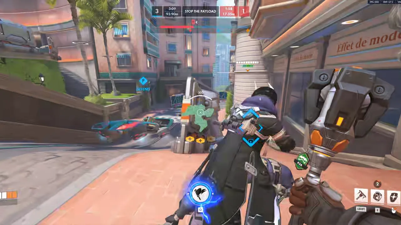 ✓ 16:9, rounded 14-18 px
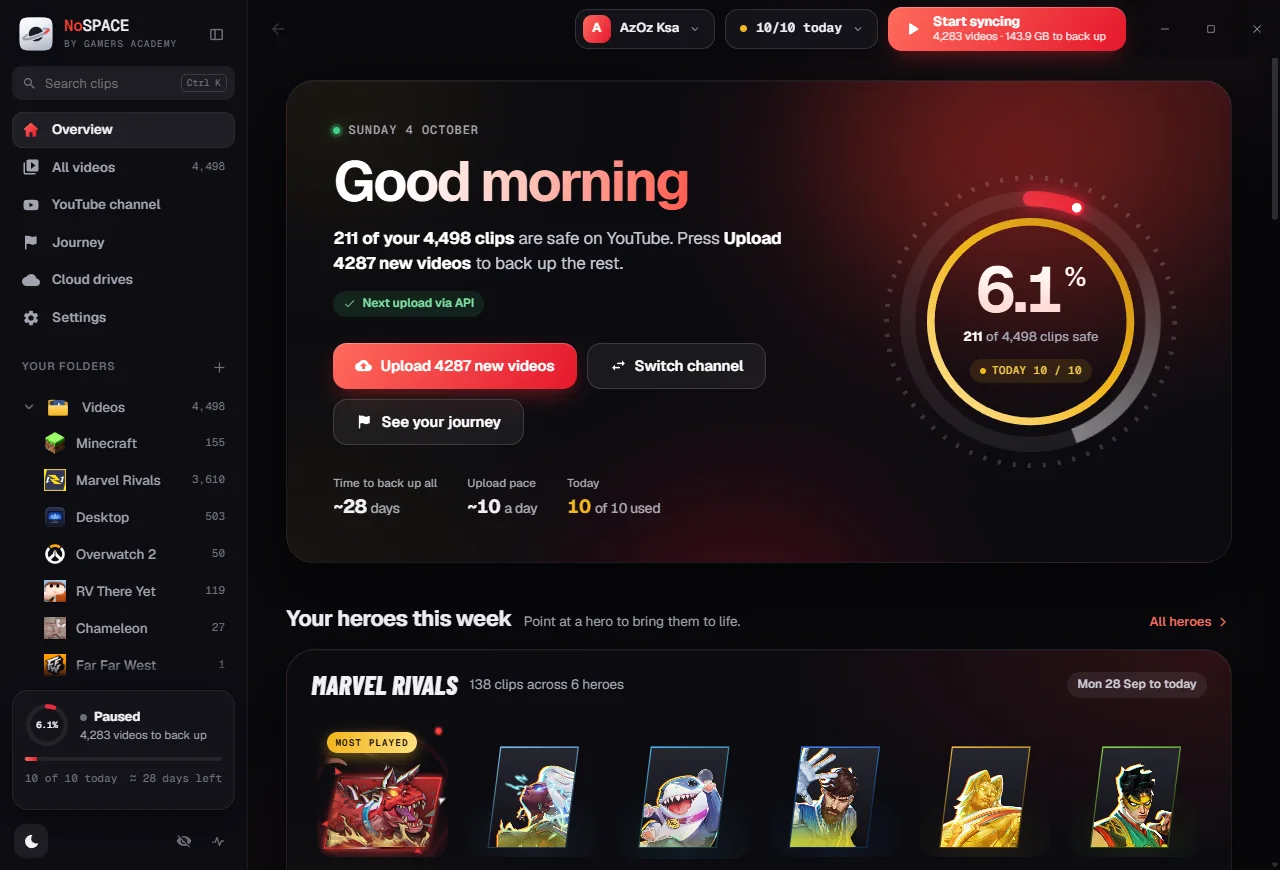 ✓ real screenshot
Pick the moment
Action in the middle third. Mid-fight, a banner, a big play. Skip menus and loading screens.
Keep it clean
No filters. To put text on footage, add a dark gradient from one side, never a color wash.
Respect owners
Use footage to show NoSPACE at work. Never use a game's logo or key art as if it were ours.
App icon and store art.
The app icon is the silver tile on its own. Store images put the mark on a dark scene with one soft red glow.
256 · Start, Store6448 · taskbar322416 · faviconMasters live in site/img/nospace-1024.png and nospace-256.png. Never redraw the icon at a size. Scale the master down.
Store listing images
NoSPACEKeep every clip.
Lose the clutter.
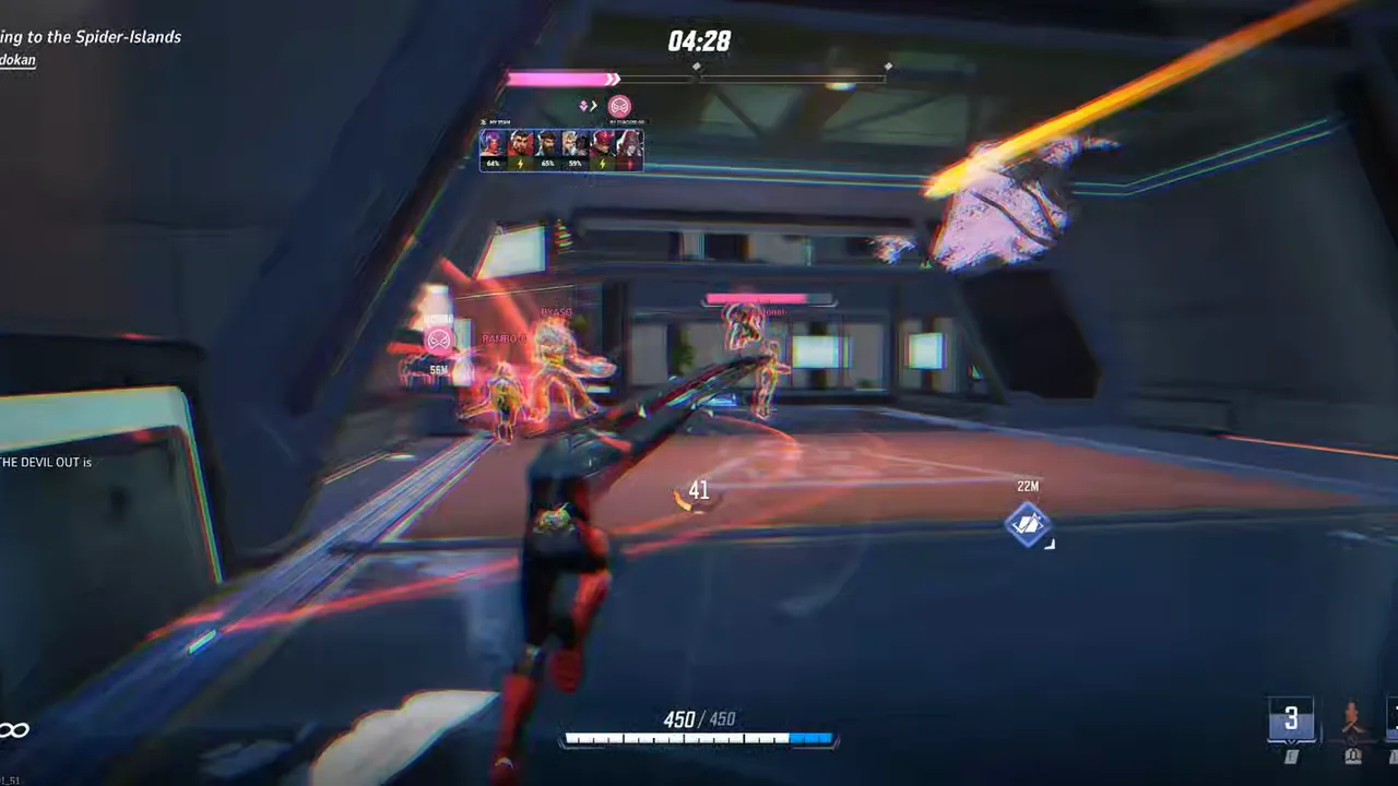 Keep every clip.
Lose the clutter.
Back up to your own YouTube. Free your disk.
| Asset | Size | Content |
|---|---|---|
| Box art (1:1) | 1080 × 1080 or 2160 × 2160 | Silver tile centered, dark scene, faint ring |
| Poster art (Microsoft calls it 9:16) | 720 × 1080 or 1440 × 2160 | Tile, wordmark, the two-line tagline |
| Hero art (16:9) | 1920 × 1080 or 3840 × 2160 | Real clip frame, dark gradient from the left, tile and tagline |
| Screenshots | 1920 × 1080 or larger, up to 10 | Real app, both themes, one idea per shot with a short caption |
| MSIX tile assets | 44, 50, 150, 310 square, 310 × 150 wide | Silver tile, transparent outside the tile, scale 100 to 400 |
Share page and phone.
The share page is always dark, because it is about the video. The phone app follows the phone's theme and keeps one card per idea.
NoSPACEGet NoSPACE04:0538.1 MB03:4537.2 MB03:4441.1 MB03:4348.2 MBOne main action
On the share page, Download is the only red button. Copy link stays quiet.
Previews that work
Every share link carries the title, a thumbnail and the video, so Discord and WhatsApp show a real preview.
Phone = glanceable
Backup percent, today's count and the sync switch first. Games below. Big tap targets.